GOUD IN TWENTE
]]>
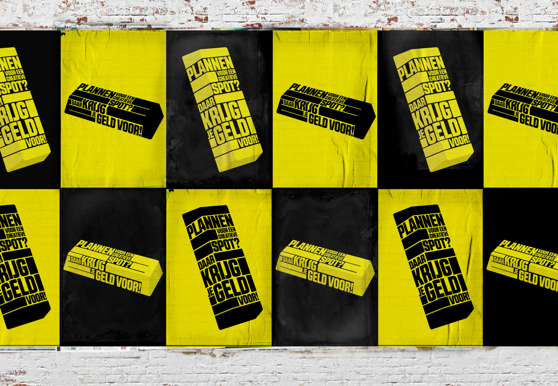
Samen Met Handstand Consultancy creëerde we een campagne voor creatieve broedplaatsen in Twente. Er is namelijk serieus geld beschikbaar om deze broedplaatsen te ondersteunen. Of het nou gaat om een workshopspace, maakplaats, kunstenaarshol of creatieve ondernemershub. De subsidie heeft als doel om deze broedplaatsen duurzamer te maken.
Creatieve ideeën en ondernemende geesten zijn er genoeg in Twente: ze zijn goud waard. Daarom de ‘Goud in Twente’-campagne. Omdat het goud hier voor het oprapen ligt en omdat de regio het goud hier wil houden.
Concept & Art: Handstand Consultancy x Elroy Klee
]]>

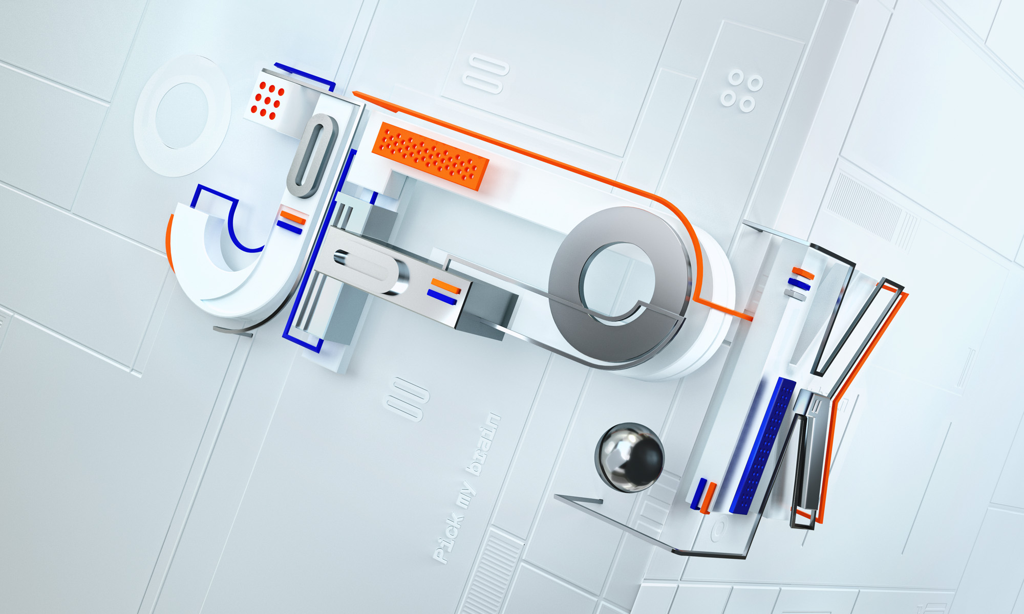
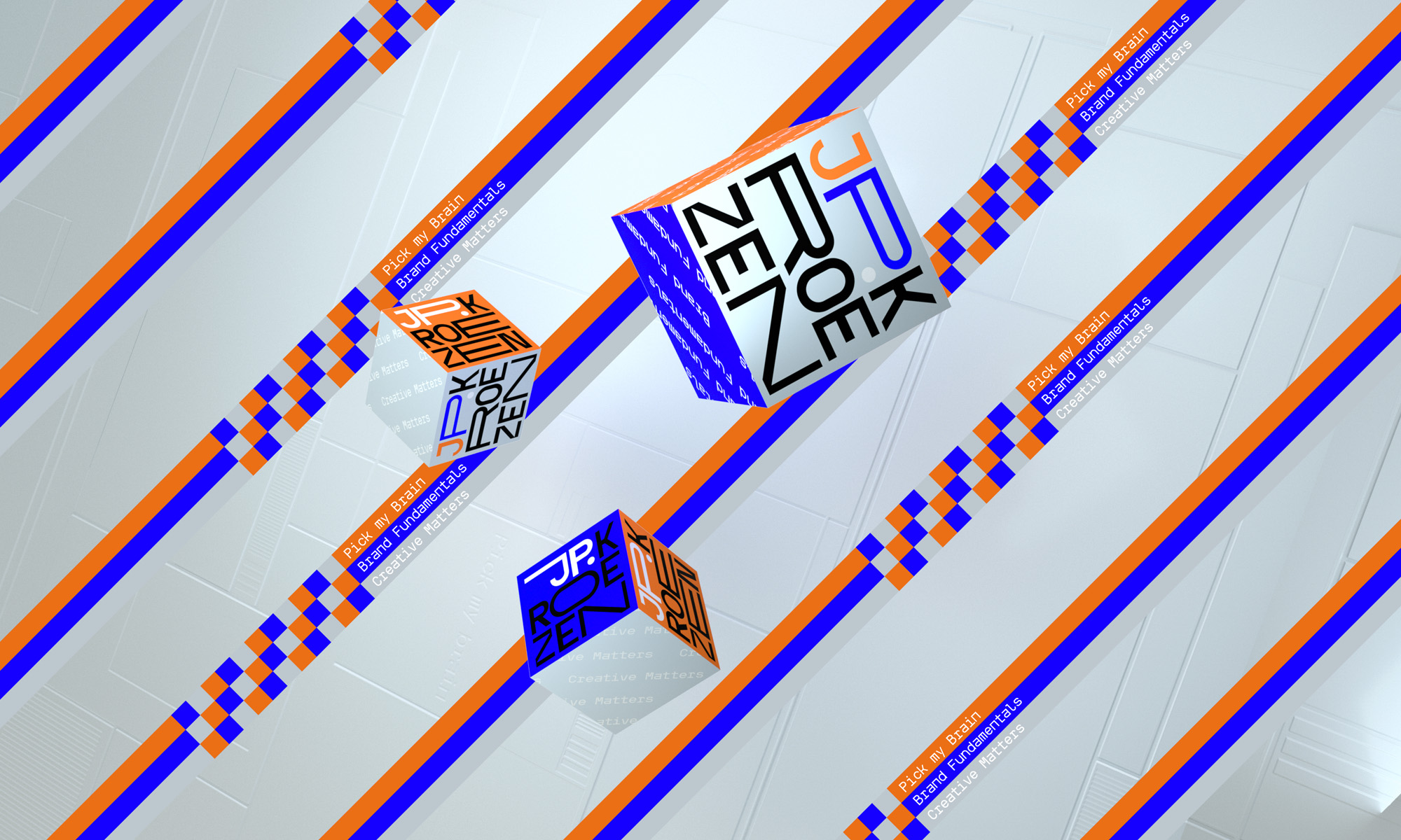
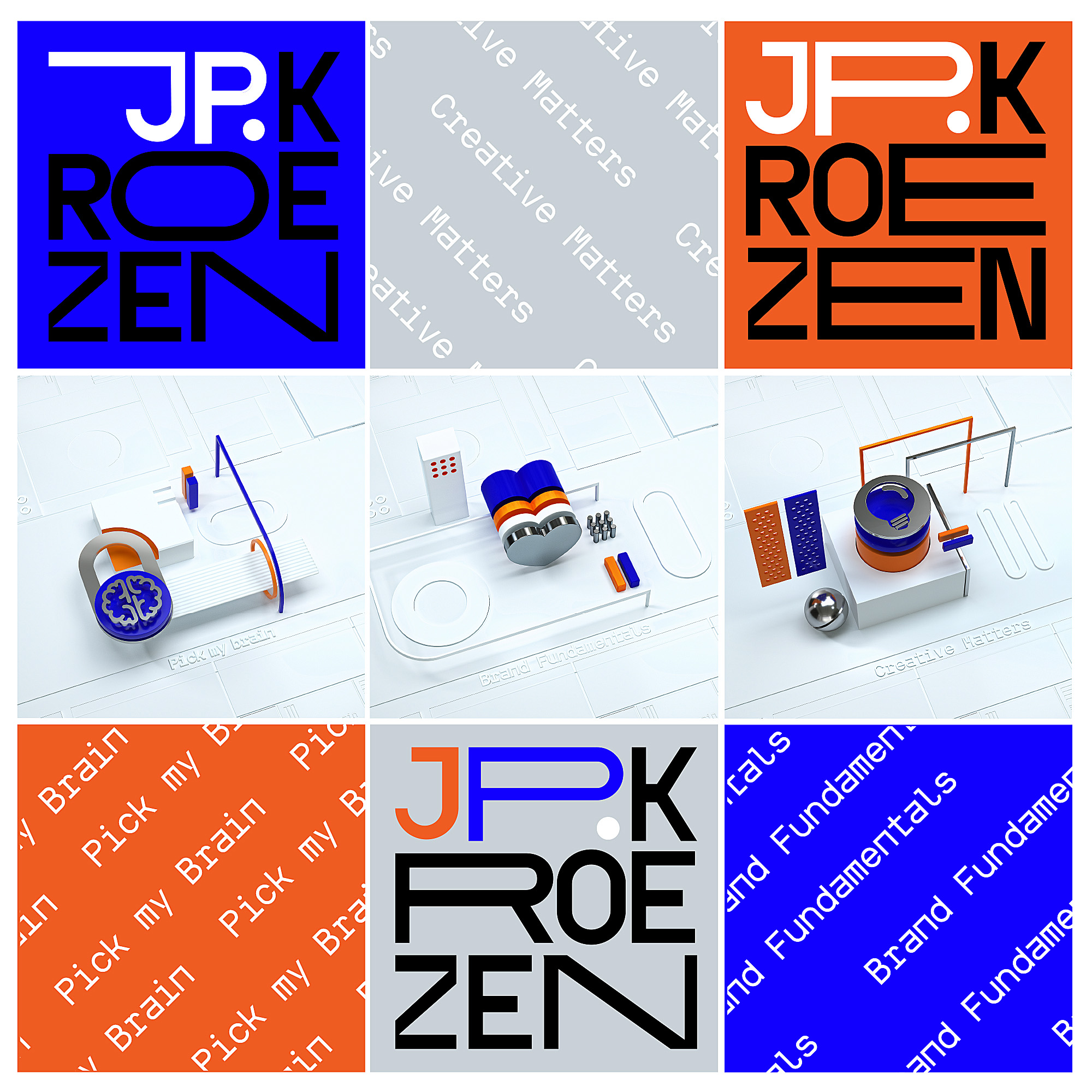
JPK
Identity and keyvisuals for the one man army. Jan Pieter Kroezen aka JPK works in the field of innovative solutions and creative concepts.
]]>
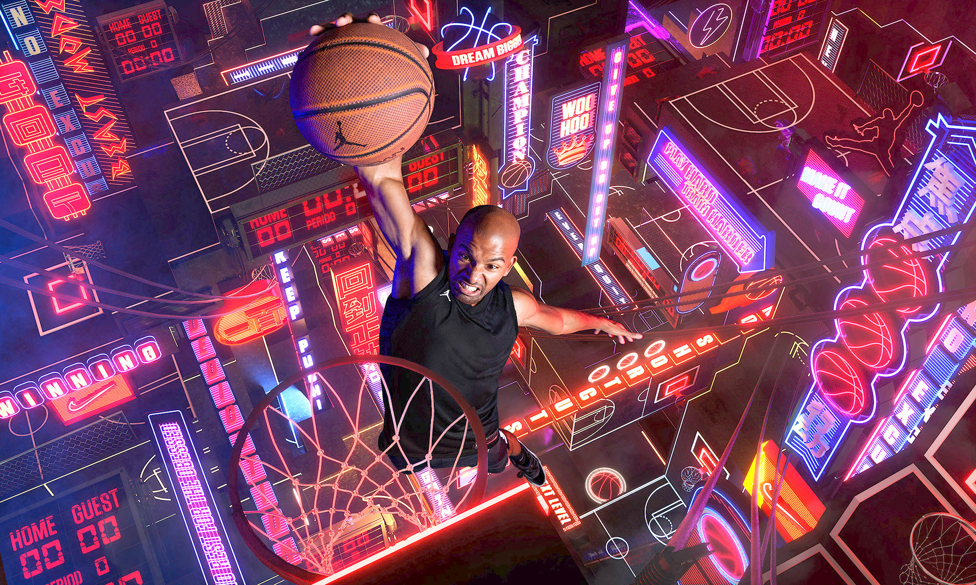
IMPOSSIBLE FIELDS
Impossible Fields: A surreal world was created to dramatize the athletes way to the top.
Inspired by the Dutch artist Escher combined with the electric nightscapes
neon streets of Shanghai. Modern art meets modern urban landscape.
Photography Maurice van der Meijs
Model: Rodney
Concept Jeena van der Heul
Retouche Martin van Zwol
3D & Art direction Elroy Klee
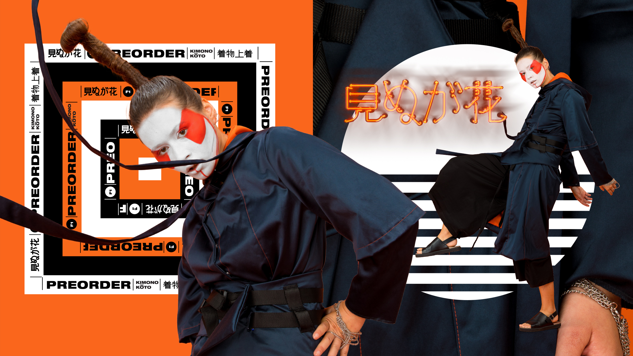
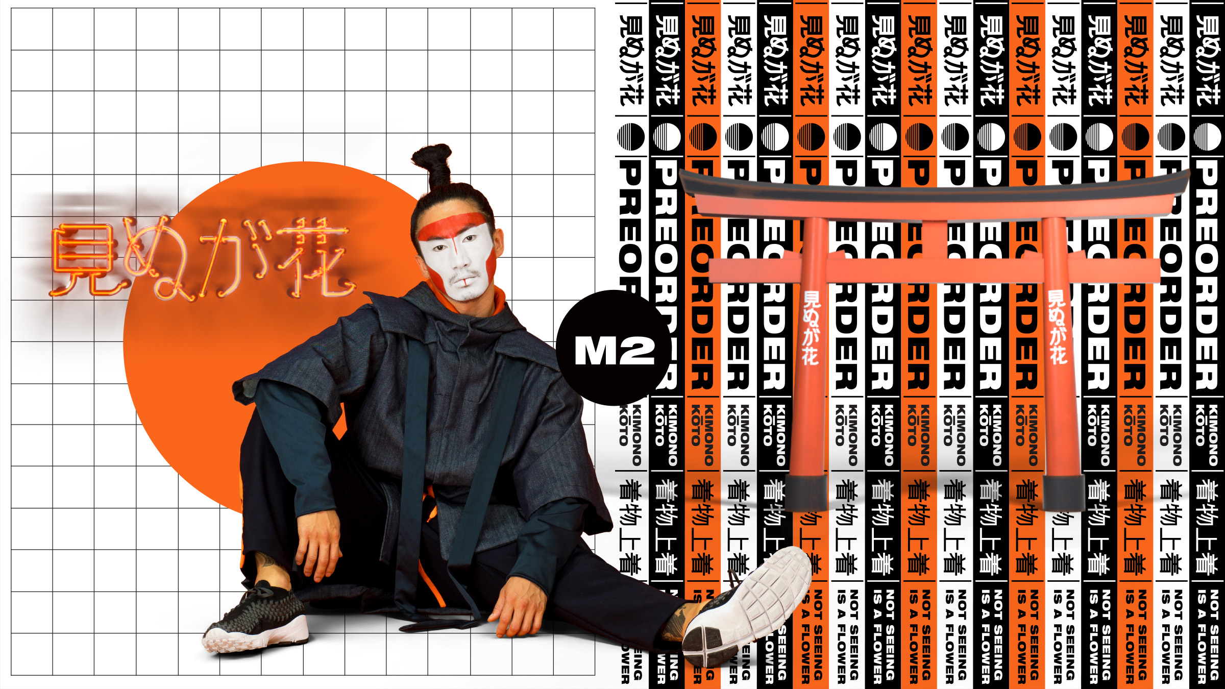
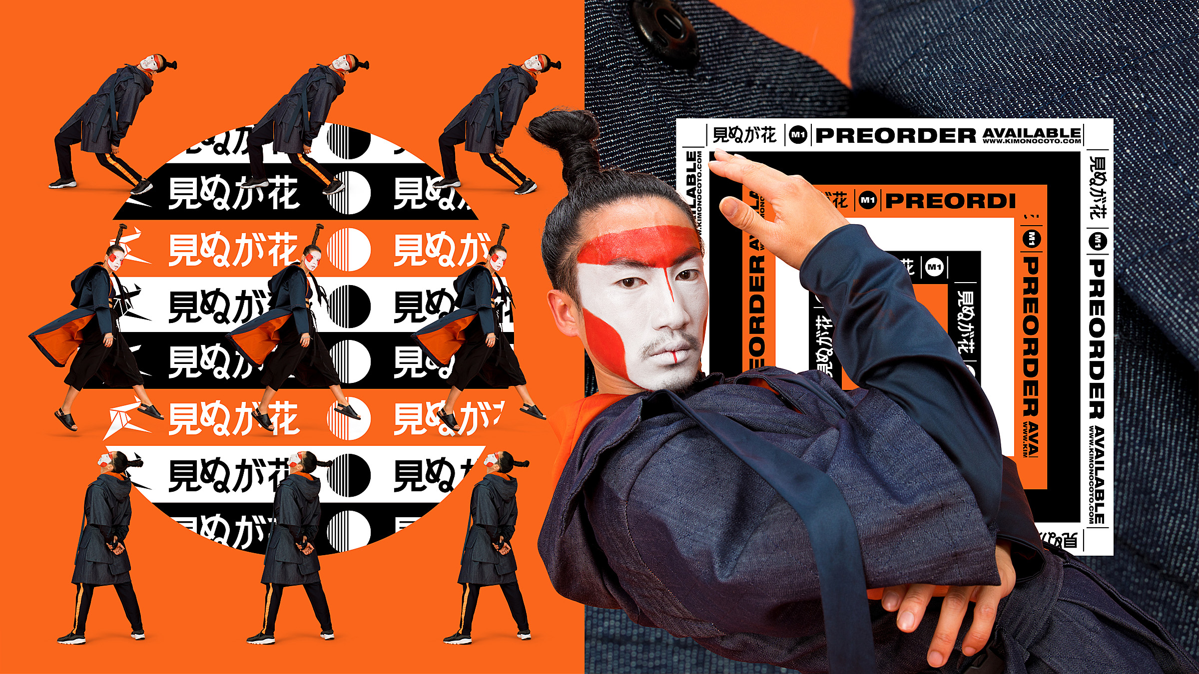
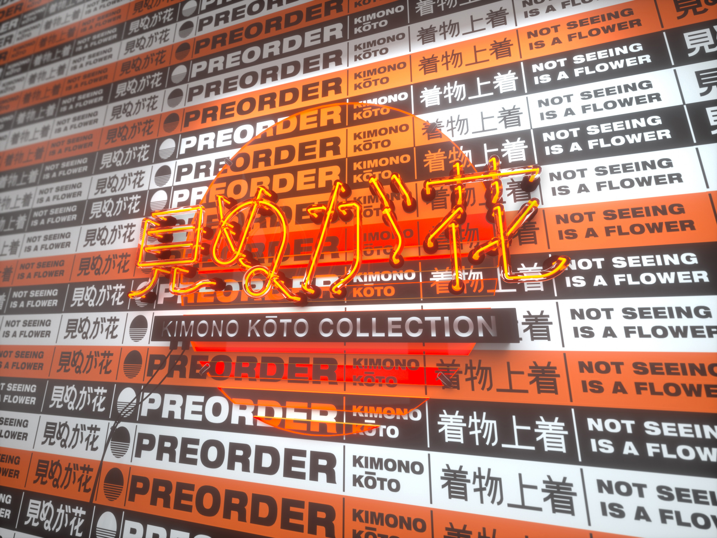
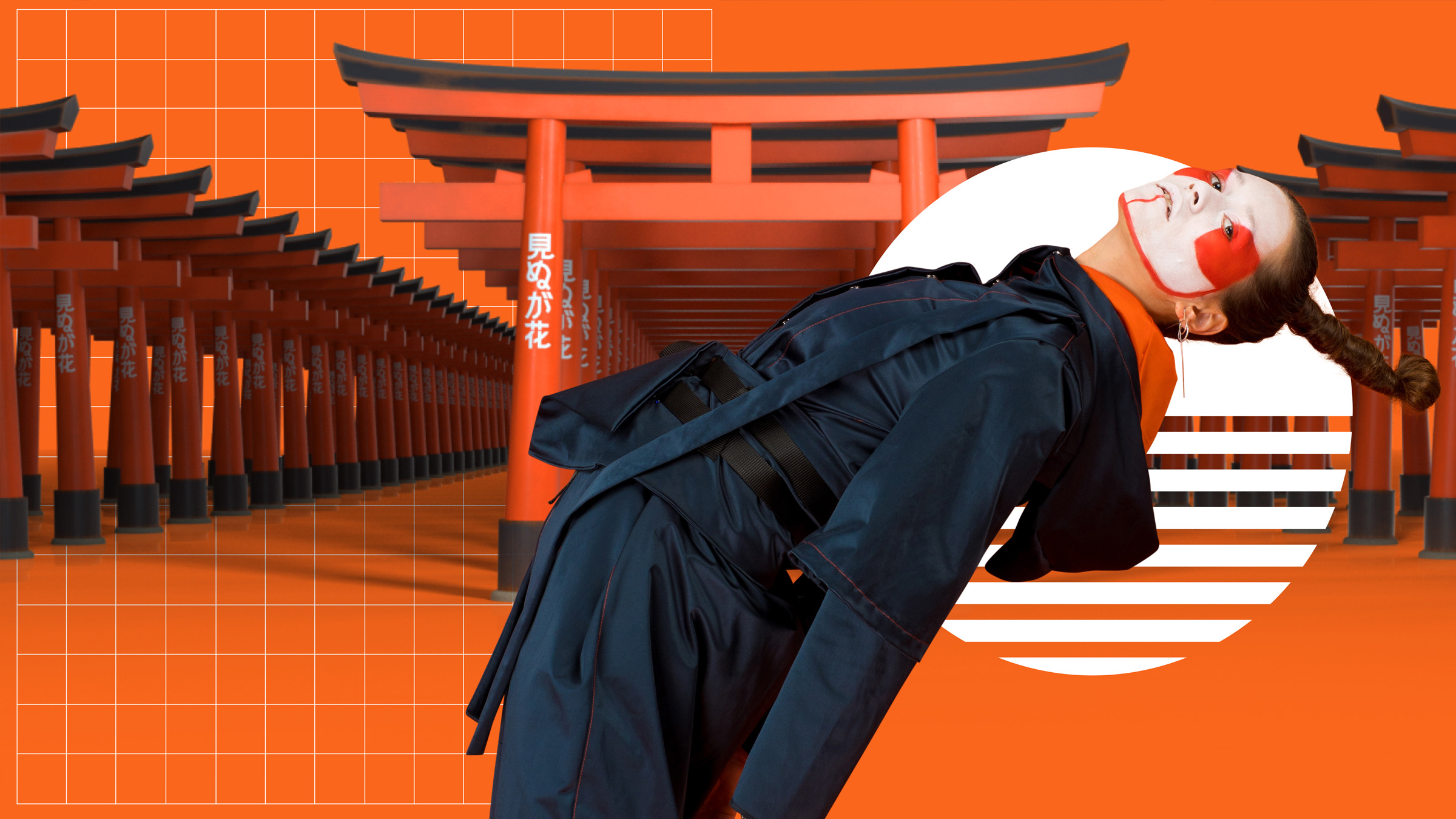
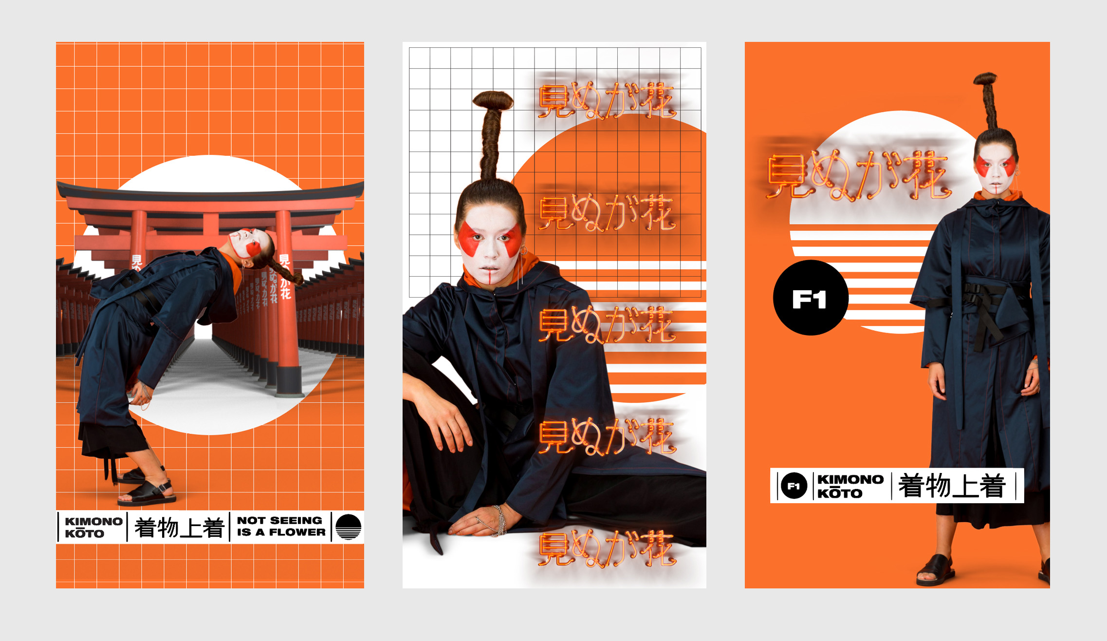
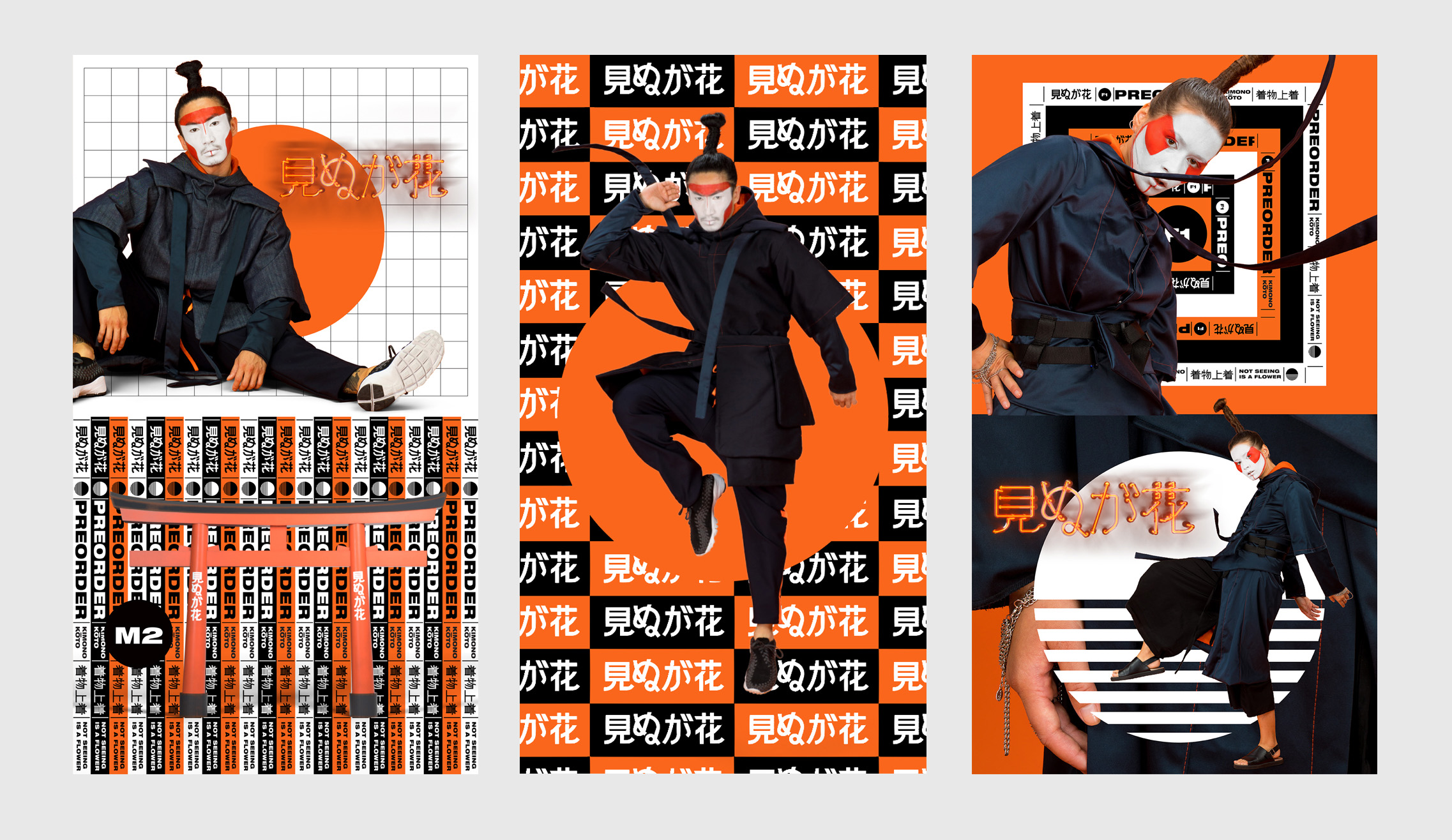
KIMONO KŌTO COLLECTION
This inspiring, new collection is comprised of 3 different handmade samurai-style hooded Kimono coats.
Each boasting its own unique and individual details.
It’s traditional Japanese clothing reinterpreted with modern appeal.
Concept: Jeena van der Heul
Fashion designer: Mirjam Manusama
Styling: Mirjam Manusama
Mua: Milena Prieto
Art Directors: Elroy Klee, Jeena van der Heul
2D & 3D motion : Elroy Klee, The Oddone, Timo Roesink
Director: Jeena van der Heul, Blanksmablanksma
Photography: Blanksmablanksma
SFX and music: Soundsright
Models: Darcy Jonathans and Chuy Nguyen
]]>
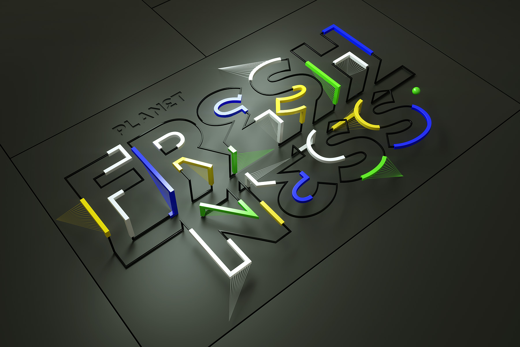
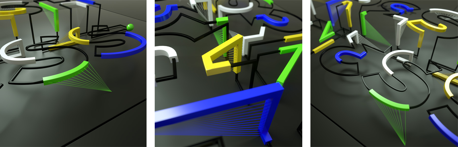
PLANET FRESHNESS
Planet Freshness combines multiple creative companies under one roof. This pieces covers a wall at their outer space nest.
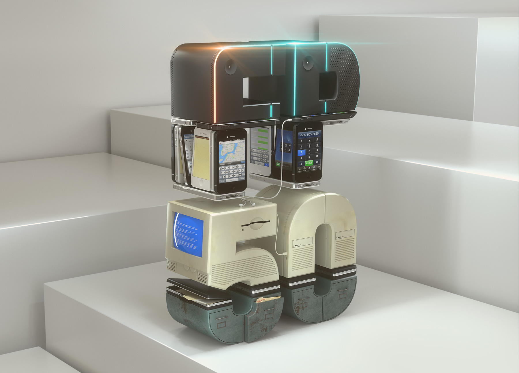
FINANCIAL PLANNING COVER
For Source Media New York I made the 2018 June cover for the FP50 Rankings. The 50 biggest independent broker- dealers are ranked by revenues, corporate staff, clients and accounts.
]]>
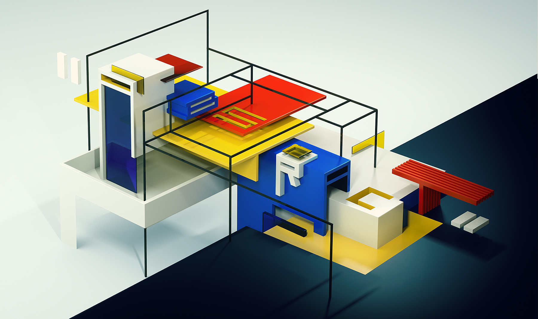
ABSTRACT
Typographic exploration in De Stijl movement, with basic visual elements such as geometric forms and primary colors. Together with talented intern Delano Klee
]]>
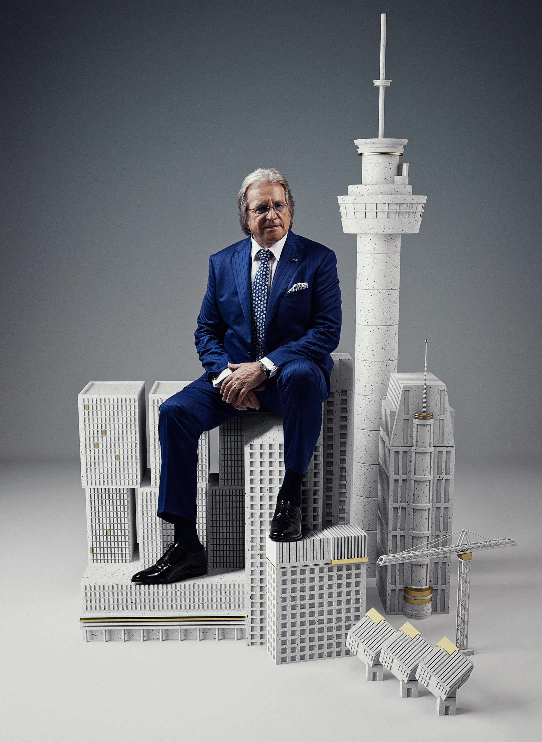
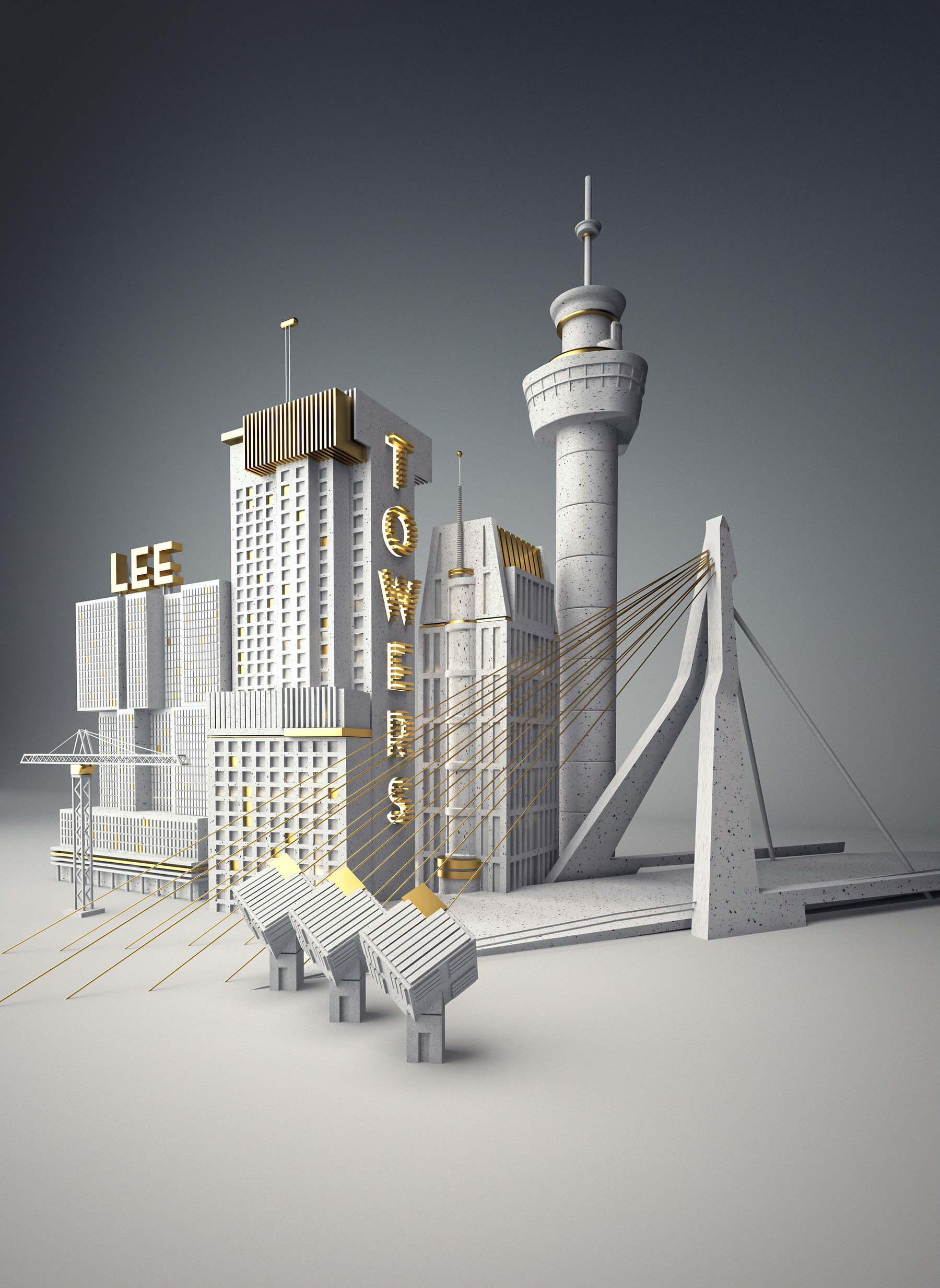
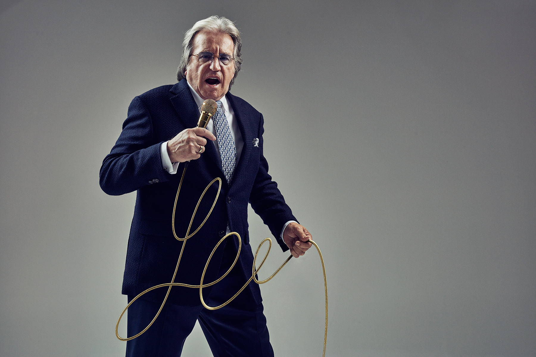
LEE TOWERS FOR JFK MAGAZINE
For this serie of images for the Dutch
JFK magazine I teamed up with the talented photographer Ruud Baan. Lee Towers is a famous dutch singer who HAILS FROM Rotterdam. The 3D illustration refers to his name and city.
]]>
FC TWENTE TOTAL BRANDING
In 2005 FC Twente was celebrating their 40 years of professional soccer. The year before we worked hard on the rebranding of the soccer logo of one of the biggest Dutch soccer clubs in history. In fact, Dutch soccer was introduced in the city of Enschede in 1885. The place where FC Twentes ground lays.
Different designs were made and discussed with the different FC Twente firms. In the 2005 the logo and all other related FC Twente products where redesigned. This goes from soccer kits, merchandising and also routing and branding of the whole FC Twente stadium.
The brand strategy we developed for the club had not only a focus on the supporters, business people and others but also on all the employees, players and staff. The brand was embraced quickly. The growth of the brand love was enormous which results in a huge increase of merchandise sales.
]]>

Desire is the engine of creation
3D illustration in collabo with intern Arjan van der Knijff